I have a hard time calling the kitchen at the 1st Street House a remodel. It was just one piece of a whole home renovation project complete with significant floor plan changes. Simply put, it was a gut. We weren’t so much remodeling a kitchen as we were building one from scratch.
I joined the owner once the structural work was done- she had already made great choices by creating an open floor plan layout that was more modern and suited her lifestyle. From here she wanted help choosing the fixtures, fittings, and finishes of the home.
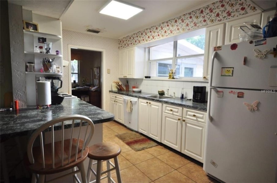
Before
Opening up this pseudo-galley kitchen was a top priority.
This side of the kitchen was clumsy and an ineffective use of space.
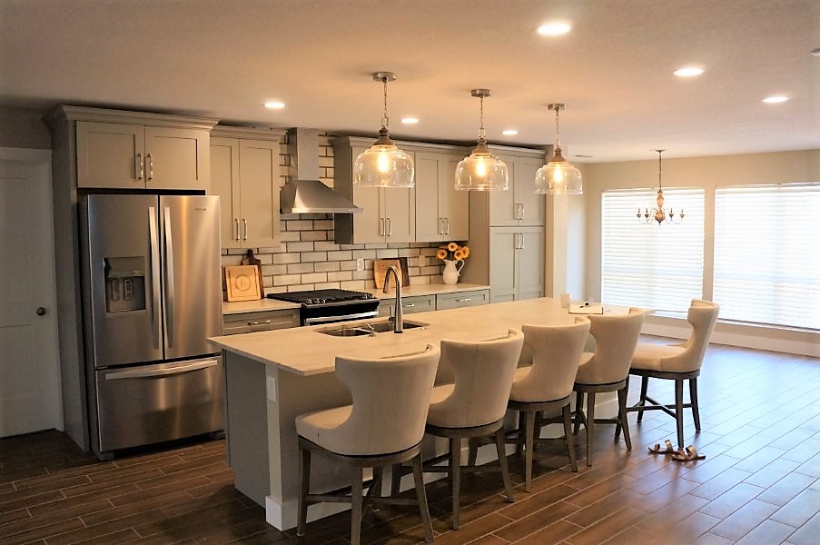
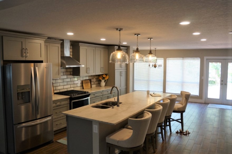
After
The new layout is open and contemporary.
It's easy to imagine family and friends gathered around this lovely and highly functional island.
As we looked as pictures and samples she consistently connected to neutral and light spaces. She was drawn to subtle and sophisticated vibes (just the tiniest bit beachy) and cozy furnishings that have a sense of luxury without being fussy.
My goal was to translate that feel into her kitchen by creating a space that was neutral and light, but that also had interest, depth, and frankly, felt expensive without actually being expensive.
She had already selected shaker cabinets from Wellborn Forest in Oyster grey and stainless steel appliances for her kitchen. We had also picked flooring for the whole home- a warm walnut ceramic wood tile from Floor & Decor that provided a great anchor all around.
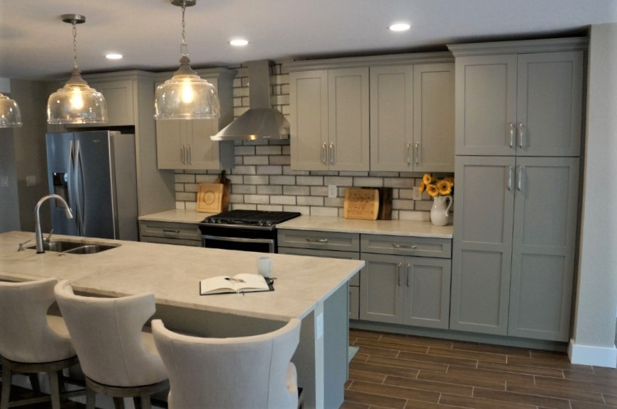
I started by searching for how I could bring the warmth and depth of the floors up higher in the room. Naturally, lighting is UP so I started there. The owner loved the look of big open glass pendants. So, how do you do big and open glass without the fixture simply disappearing? I found these fabulous (and remarkably reasonable) large glass pendants from Capital Lighting at Build.com. They feature a handcrafted mango wood finial and an organic rippled shade. They had texture, they had scale, they had warmth, I hadn’t seen anything like them, and they were very affordable. DONE.
The kitchen pendants from Capital Lighting are loaded with details.
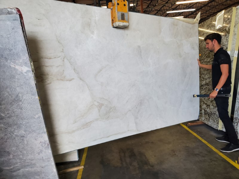
Next, we went counter shopping. The owner and I visited a stone wholesaler looking for something light without too much bold movement. We tried our best to like the more affordable slabs, but we found this beauty and… the heart wants what the heart wants. These are the reasons why we work so hard to use our dollars wisely, folks. So when you fall in love with an incredible piece of stone, you can buy it and know it was the right decision. It is a huge feature in this kitchen and will never go overlooked (just the right kind of place to go big).
This exceptional natural quartzite with a leather finish was definitely a splurge, but I’m certain she will never tire of admiring it or running her hands over its soft finish. The stone is special in a way that does not translate in pictures. The swirls and sweeps of creamy color are graceful and it is just a knockout.
This is effectively a stone slab's runway walk.
From there I when hunting for a backsplash. I could get lost in the aisles of a tile store just like I could get lost in the aisles of a bookstore, so I was all too happy to go searching for something that suited our needs. The owner loved the classic and clean appeal of subway tile, but like our other choices, I knew we needed something unique to bring interest to the space. Let’s face it, if you’re not careful, neutral and light can quickly end up being boring and bland.
I found this gem and was immediately pulled to its tones and character. Indulge me while I share a little backstory on this tile… So this larger scale subway tile by Ivy Hill Tile is designed to look like old industrial glass windows. The worn colors you see on the border aren’t intended to look like a grout line, but actually like the metal frame of aged commercial factory windows. What I loved about them was all the nuance they offer. Not just on the edges, but in the center of the tile also. Some have a bit of a screen texture, some glazed rippling, some even a little crackling. And they are so easy to use because they have those magic color tones that seem to compliment so many different palettes and décor styles. We set ours in a brick pattern because we weren’t trying to have the backsplash look like an actual industrial window and the effect is stellar. Still clean and classic, but with the depth and character that we absolutely needed.
The contractor looked at me sideways when I showed them to him and truly, I had cold feet on this one at the last minute too. But once they were on the wall, he agreed, they were fantastic. Many people who have seen them tell me that they’re looking for a place to put them in their homes too (I’m considering it also)! This tile is just a great example of how a non-literal translation of something can take a space to a whole new level.
We wrapped up the kitchen design with strong functional items and some straight up cabinet jewelry. We chose the Delta Essa Touch2O Single-Handle Sink Faucet in Arctic Stainless with matching soap dispenser both from Amazon. I LOVE this faucet. I buy it whenever I can. The touch functionality is so useful and the styling is perfect for a transitional kitchen.
We chose the Westerly 6 5/16″ satin nickel pulls by Amerock. We opted for the longer length to balance the size of the open kitchen and the satin nickel to catch the light and effectively act as highlights on the cabinetry. In full disclosure, I sold Amerock products to the big home centers in my previous life. Maybe that makes me biased, but honestly, I shop all the hardware brands and nearly always buy Amerock. They win my vote with their quality, styling, and value. *Tip, you can get a bit more visual length for “free” if you pick a footed design. The feet allow you to see more of the pull where it meets the cabinet and shows off interesting angles and curves on the hardware.
Overall, this kitchen is an example of how the little things like texture, delicate patterns, and unique elements can take a kitchen from meh to marvelous. They say “the Devil is in the details”, we’ll Heaven sits in the details too. It’s the subtle things in this kitchen that make it so special. When you thoughtfully balance your material choices you can create a finished result that looks custom, designer, and simply so much more expensive than it actually was.
Here’s to a better remodel: more beautiful & economical with less stress!


")